
Glass Packaging Insights
Guides & Insights
The "Skin Color" of Glass Bottles: How Color Became the Silent Language of Liquor Packaging
On a liquor store shelf, the first thing consumers see is often not the label, but the color of the bottle. Clear, amber, dark green, cobalt blue, or even pure black—each color silently conveys a message about what type of liquor it holds, what tier it belongs to, and what style it represents.
On a liquor store shelf, the first thing consumers see is often not the label, but the color of the bottle. Clear, amber, dark green, cobalt blue, or even pure black—each color silently conveys a message. It tells consumers what type of liquor this is, what tier it belongs to, and what style it represents. And none of this is a random choice by designers. It is the result of centuries of functional needs, craft evolution, and market competition.
Color Was Originally About Survival, Not Beauty
The earliest glass bottles were almost all transparent, because transparency is the most natural state of glass. But transparency had a fatal problem: light accelerates the oxidation and deterioration of liquor. Especially for wine and spirits, prolonged exposure to ultraviolet light causes flavors to fade rapidly.
When the English fired glass in coal-fueled high-temperature furnaces in the 17th century, they accidentally produced a dark-colored glass. This color came from iron impurities in the raw materials and sulfides produced by coal combustion. What was originally a sign of "impurity" accidentally became a barrier protecting the liquor. Dark glass blocked most ultraviolet light, allowing the wine to develop slowly and steadily inside the bottle.
From that point on, color was no longer just an appearance issue—it became a "survival strategy" for liquor packaging. Dark bottles were not for beauty; they were to help the liquor live longer.
Different Colors Correspond to Different Liquor Identities
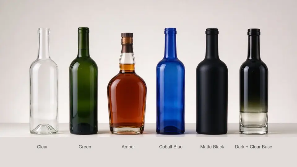
As glass craftsmanship matured, people began to consciously control color and bind it to liquor categories. This binding was not a mandatory rule, but a tacit understanding formed through long-term market selection.
Dark green has become almost the standard for Bordeaux and Burgundy wines. It blocks light while visually conveying a signal of "classic, traditional, age-worthy." Amber is common for brandy, whiskey, and rum, because amber itself is close to the color of the liquid, enhancing the overall warmth and weight. Clear bottles are mostly used for vodka, gin, and some white wines, because they need to showcase the purity and clarity of the liquid, conveying an impression of "clean, crisp, modern."
Cobalt blue is an exception. It provides almost no light-blocking function, yet it is widely used in certain premium spirits and limited editions, because it conveys a signal of "rare, unique, collectible." Here, color is no longer about function—it is pure visual marketing.
Pure black is even more extreme. It completely blocks light while giving off a mysterious, strong, even slightly aggressive feel. In recent years, it has appeared frequently in high-end whiskeys and limited-edition spirits, precisely because it creates a strong visual impact on the shelf.
How Color Is "Burned" Into Being
The color of a glass bottle is not painted on—it is "burned" into being in a high-temperature furnace. Different metal oxides produce different colors in molten glass: iron oxide produces green, cobalt oxide produces blue, manganese oxide produces purple, chromium oxide produces dark green, and carbon and sulfides produce amber or brown.
This means color control is one of the most difficult and demanding aspects of glass manufacturing. With the same batch of raw materials, a slight fluctuation in temperature or a slight change in furnace atmosphere can cause color deviation. For B2B clients, batch-to-batch color consistency is often an important standard for judging whether a glass bottle supplier is professional.
There is also an easily overlooked problem with dark glass: the darker the color, the harder it is to see the state of the liquid inside. Therefore, some premium liquor brands choose designs like "dark body + clear base" or "dark body + localized clear areas," preserving light-blocking function while still showcasing the color and clarity of the liquid when pouring.
Colors That Can't Be Burned Are "Sprayed" On
Not all colors can be burned into the furnace. Cobalt blue, pure black, frosted white, metallic tones, gradient effects—if these were achieved through body tinting, they would either be extremely costly or simply impossible. So spraying became another path.
Spraying involves coating the surface of an already formed glass bottle with paint through a spray gun or automated equipment, then baking and curing it. It does not require changing the glass furnace formula, so minimum order quantities are lower, lead times are shorter, and color freedom is greater. A clear glass bottle sprayed with matte black becomes mysterious and strong; sprayed with frosted white, it becomes minimalist and modern; sprayed with a gradient blue, it becomes a limited-edition visual.
But spraying has its costs. The coating will gradually wear away with time, friction, and washing, and its adhesion is not as stable as body tinting. In the recycling process, sprayed bottles are also more complex to handle than ordinary glass bottles. Therefore, spraying is more often used for mid-to-high-end, limited-edition, or short-term marketing products, rather than basic items that need long-term circulation.
For B2B clients, this is actually a multiple-choice question: If you want controllable cost, stable color, and suitability for large-scale production, choose body tinting. If you want high color freedom, low minimum order quantities, and suitability for rapid trial production, choose spraying. Neither path is superior—it is only about what fits.
From "Just Block Light" to "Color Is Brand"
Today's glass bottle colors have long surpassed pure functional needs. They have become part of a brand's identity system. If a brand consistently uses a specific shade of bottle, consumers can recognize it without even looking at the label.
This also brings new challenges to B2B procurement. Clients no longer just ask "Do you have dark green?" They provide specific color codes, light transmission rates, and even performance requirements under different light sources. Some clients require "greenish under natural light, brownish under warm light." Others require "the bottle color to contrast with the liquid color, rather than blending into it."
At the same time, tightening environmental regulations are also affecting color choices. Dark glass is harder to recycle than clear glass because it requires additional color-sorting processes; sprayed bottles are even more complex to recycle. Some markets are beginning to encourage the use of clear or light-colored glass to improve recycling rates. This means that future glass bottle color choices must consider not only brand and function, but also recycling and carbon footprint.
Color Is the Most Silent yet Most Powerful Language of Glass Bottles
From that 17th-century "black bottle" that darkened due to impurities, to the colorful liquor bottles on today's shelves, color has always played a dual role: externally, it is the first line of communication between brand and consumer; internally, it is the balancing result among function, craft, and cost.
For B2B professionals in the glass bottle export business, understanding color is understanding half of your client's needs. Because what clients buy is never just "a bottle"—it is a container that speaks for them, protects their liquor, and fights for attention on the shelf.
And color is the most silent yet most powerful language of that container.